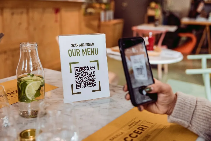
Peak hours squeeze everything: queue at the host stand, pings from delivery apps, a line of tickets on the pass. When a guest scans a code, they expect a clean menu, clear prices, and the shortest path from “what looks good?” to “order sent.” If the page drags, buttons jump under the keyboard, or photos weigh a ton, the table goes quiet and the bar backs up. Mobile-first menus aren’t a trend piece; they’re the difference between a smooth turn and a stalled section.
For a quick feel of how lean flows should behave on entry screens—phone number, one-time code, first view— read more and benchmark your own steps against it. If your “hello” page takes longer, asks for more taps, or hides the next action below the fold, every minute of the dinner rush will magnify the pain. The goal is simple: one hand, one thumb, one clear action per screen.
Design the first 30 seconds, not the perfect brochure
Guests decide whether your digital menu “works” before they read a single description. The first screen has one job: reassure and direct. Use a short headline (“Start your order”), a single CTA, and a visible price cue. Skip long intros, pop-ups, and forced account creation. If you need an OTP, keep it in the same flow and auto-read codes where policy allows. When that first scan is friction-free, people start browsing—and ordering—without asking staff for help.
Make the content scannable at table distance
Phones sit on the table, not at eye level. That means bigger tap targets, generous line height, and photos that load sharp but light. Put category filters at the top (Mains, Small Plates, Sides), show dietary tags only where they matter, and keep modifiers short. Prices should line up—left or right—but never float. If a guest has to pinch-zoom to compare two burgers, you’ve already lost a beat.
Speed over sparkle: assets, layout, and retries
Fancy carousels and heavy fonts look great on Wi-Fi at noon; they stall on Saturday at eight. Compress images, lazy-load anything below the fold, and choose system fonts that paint instantly. Validate forms asynchronously so taps never feel blocked. If a request fails, say so in plain words and offer a retry without clearing the cart. The kitchen can handle a surge; the network sometimes can’t. Your job is to make failure graceful.
Train the flow, not the guest
A good menu lets servers guide without holding a phone. Keep specials at the top of each section, put add-ons next to the items they lift (fries with burgers, greens with steak), and keep allergen notes consistent. When the layout mirrors how the team talks—“Would you like to add a side?”—attachment happens naturally. That’s service design, not just UI.
A single, useful list you can act on today
- One idea per screen: headline, one CTA, no clutter.
- Thumb-zone buttons: primary action within easy reach on small devices.
- Lean entry: phone → code → menu; defer heavy asks until after first order.
- Readable cards: big tap targets, aligned prices, short modifiers.
- Fast assets: compressed images, lazy-load below the fold, system fonts.
- Human errors: plain messages, inline fixes, retry without losing the cart.
Measure what the rush cares about
Look at median “scan → first item view,” “first item → add to cart,” and “cart → paid.” Track exits by device tier and network type; the dinner crowd brings both low-end phones and crowded cells. When numbers sag, reproduce on a budget handset over patchy data. Fix what you feel: image weight, script order, hidden CTAs. Small wins—300 ms here, one fewer field there—stack into calmer turns and happier guests.
Mobile-first menus aren’t about showing everything; they’re about showing the next right thing, fast. When guests can scan, decide, and send without friction, hosts seat more, servers guide better, and the pass breathes. That’s the rhythm you’re buying with a clean flow—and the one you keep when the room is full.